This page is about using Custom Data. In order to use it, you must first add Custom Data to indexed items.
Custom data that is stored in URL GET encoded format can be used as a filter data source, for search results. For example if documents in the index have a custom data field named 'publishDate', which holds yyyy-mm-dd formatted data, then it is possible to filter out documents that do not match a filter's date range.
There are several types of underlying filter that can be used:
2 documents (A and B) have a custom data field 'author'. For document A, author="Andrew" and for document B, author="Brenda".
If the filter is set to "Andrew" then document A will pass and B will not. If the filter is set to "Andrew OR Brenda" (typically meaning Andrew and Brenda options were checked) then both documents will pass.
2 documents (A and B) have a custom data field 'authors'. For document A, authors="Andrew,Brenda,Nick" and for document B, author="Brenda".
If the filter is set to "Brenda" then document A and B will pass. If the filter is set to "Andrew OR Brenda" (typically meaning Andrew and Brenda options were checked) then both documents will pass also.
2 documents (A and B) have a custom data field 'authors'. For document A, authors="Andrew,Brenda,Nick" and for document B, author="Brenda".
If the filter is set to "Brenda" then document A and B will pass. If the filter is set to "Andrew AND Brenda" (typically meaning Andrew and Brenda options were checked) then document A will pass also.
The underlying filters described above can be presented to the user with a variety of Controls (where it makes sense to do so). For example an 'int' filter might be presented to the user with 2 text boxes (allowing entry of an integer range), or the 'int' filter might be presented to the user with a dropdown menu, or a group of checkboxes.
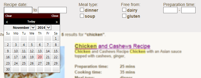
To add a filter control to the page, add a DIV with class 'sew_filterControl' (remember it is possible to have multiple CSS classes apply to an element, just separate with a space).
        <div class="dateFilter sew_filterControl">
            <!--{   "FieldName":    "publishDate",
                    "ControlType":  "calendar",
                    "Label":        "Recipe date:",
                    "Type":         "date",
                    "Options":      []}-->
        </div>
Inside of the DIV is a comment containing JSON formatted meta data. JSON formatting uses the same simple object notation used by Javascript, essentially; "[]" means an array, "{}" means an object, and inside of the braces appear "property name: "value".
The properties set inside of the JSON meta data will control what data field the filter works with, how the Control appears and how it operates, the table below shows possible values for each property.
Use care not to make syntax errors when writing JSON meta data, there are various online JSON validators available
| FieldName | ControlType | Type | Label | Options | OptionLabelFormat | GetLiveDataFromServer | |
|---|---|---|---|---|---|---|---|
| Name of the CustomData field | Control type to use | Underlying filter type | User friendly label | Options specific to the control | For labels that are based on option values | Whether to show filter options based on search result data | |
| Calendar/date-pickers | * | "calendar" | "date" | text shown to the left of the date pickers |
[] - if no options specified ["yyyy-mm-dd"] - to specify the earliest possible date available ["yyyy-mm-dd", "yyyy-mm-dd"] - to specify the selectable date range |
n/a | "true"** or "false" |
| Checkboxes | * | "checkboxes" | "int" "stringor" "stringand" "stringlistand" "stringlistor" |
text shown to the left of the checkboxes | [{ "value": "option1", "label": "label1" }, { "value": "option2", "label": "label2" }, ...] - a checkbox is shown for each array element, with the checkbox label and filter selection set to the "label" and "value" specified respectively. | n/a | "true"** or "false" |
| Integer range checkboxes | * | "checkboxesIntRange" | "int" | text shown to the left of the checkboxes | [{ "value":"0-2000" }, { "value":"2000-5000"}, ...] - a checkbox is shown for each array element, with the checkbox label set to the "value" specified according to the OptionLabelFormat. The values specified should be in the format of low-high. | "${0} - ${1}" - where ${0} is replaced with the low-end option and ${1} is replaced with the high-end option. | "true"** or "false" |
| Drop down menu | * | "dropdown" | "int" "stringor" "stringand" "stringlistor" "stringlistand" |
text shown to the left of the SELECT | [{ "value": "option1" }, { "value": "option2" }, ...] - an OPTION is added for each array element, with the text set to the "value" specified. | n/a | "true"** or "false" |
| Integer range textboxes | * | "textboxesIntRange" | "int" | text shown to the left of the first textbox | n/a | n/a | n/a (no options shown to user) |
| Geolocation/distance based range | * | "geolocation" | "geolocation" | 2 labels, first is for search origin and second is for distance drop down | [{"name":"option1 name", "value": "option1" }, {"name":"option2 name", "value": "option2" }, ...] - an OPTION is added for each array element, with the text set to the "name" specified. | n/a | n/a (no options shown to user) |
* - specify the field's name (that the filter should operate on) as it appears in the CustomData.
** - use with caution, this can cause extra work on the server (sampling and sorting data), extra data transmission to client (up to 500 unique data items). It is suggested that if there are thousands of different data values assigned to custom data, or many tens of thousands of possible results that this option not be used.
Some example filter definitions.
    <!--Geolocation selection (see section below on geolocation)-->
    <div class="sew_filterControl">
        <!-- {"FieldName":"geolocation", "ControlType":"geolocation","Label":"Location:", "Label2":"Within:",
                    "Type":"geolocation",
                    "Options":[{"name":"Any", "value": "" }, {"name":"1 mile", "value": "0-1" },
                                {"name":"5 miles", "value": "0-5" }, {"name":"10 miles", "value": "0-10" },
                                { "name":"20 miles","value": "0-20" }, {"name":"50 miles", "value": "0-50" },
                                {"name":"100 miles", "value": "0-100" }], "GetLiveDataFromServer": "false"} -->
    </div>


    <!--Date picker-->
    <div class="sew_dateFilter sew_filterControl">
        <!-- {"FieldName":"manufacturedDate", "ControlType":"calendar",
                "Label":"Manufacture date:", "Type":"date", "Options":["2000-01-01"]}-->
    </div>

    <!--Checkbox chooser for manufacturer-->
    <div class="sew_stringOrFilter sew_filterControl">
        <!-- {"FieldName":"make", "ControlType":"checkboxes",
                "Label":"Manufacturer:", "Type":"stringor", "Options":[{ "value": "Ford" },
                    { "value": "Toyota"  }, { "value": "Volkswagon"  }],
                "GetLiveDataFromServer": "true"}-->
    </div>

    <!--Drop down model year selector-->
    <div class="sew_intListFilter sew_filterControl">
        <!-- {"FieldName":"modelYear", "ControlType":"dropdown",
                "Label":"Model year:", "Type":"int", "Options":[{ "value": "1979" }, { "value": "1980" },
                        { "value": "1987" }, { "value": "2010" }, { "value": "2013" },
                        { "value": "2014" }], "GetLiveDataFromServer": "true"} -->
    </div>

    <!--Checkbox based price range selector-->
    <div class="sew_intRangeFilter sew_filterControl">
        <!-- {"FieldName":"price", "ControlType":"checkboxesIntRange","Label":"Price:",
                    "Type":"int", "OptionLabelFormat":"${0} - ${1}",
                    "Options":[{  "value":"0-2000" }, {  "value":"2000-5000" }, {  "value":"5000-10000" },
                    { "value":"10000-20000" }, { "value":"20000-50000" }],
                    "GetLiveDataFromServer": "true"} -->
    </div>

    <!--2 textbox int range selector-->
    <div class="sew_intRangeFilter sew_filterControl">
        <!-- {"FieldName":"price", "ControlType":"textboxesIntRange","Label":"Price:", "Type":"int",
                    "Options":[], "GetLiveDataFromServer": "false"} -->
    </div>

    <!--Or based checkbox selector for features-->
    <div class="sew_stringOrFilter sew_filterControl">
        <!-- {"FieldName":"options", "ControlType":"checkboxes","Label":"Options:", "Type":"stringlistand",
                    "Options":[{ "value": "Auto" }, { "value": "Electric windows"  }, { "value": "Manual"  },
                    { "value": "Hatchback"  }, { "value": "AC"  }], "GetLiveDataFromServer": "true"}-->
    </div>
A complete example page with 3 filters.
If you are using .NET 5 or .NET 2, you must also add one these lines in the examples below
keyotiSearch.setServiceType('core'); //for .NET 5

keyotiSearch.setServiceType('asmx'); //for .NET 2
<!DOCTYPE html>
<html xmlns="http://www.w3.org/1999/xhtml">
    <head>
        <title></title>
        <link href="/Keyoti_SearchEngine_Web_Common/SearchUnit.css" rel="stylesheet" />
        <script src="/Keyoti_SearchEngine_Web_Common/SearchUnit.js"></script>
    </head>
    <body>
        <div id="sew_searchBoxControl"></div>

        <div id="sew_filterControls">

                <div class="sew_filterControl">
                    <!--{
                        "FieldName":    "manufacturedDate",
                        "ControlType":  "calendar",
                        "Label":        "Manufacture date:",
                        "Type":         "date",
                        "Options":      ["2000-01-01"]}-->
                </div>

                <div class="sew_filterControl">
                    <!--{
                        "FieldName":    "make",
                        "ControlType":  "checkboxes",
                        "Label":        "Manufacturer:",
                        "Type":         "stringor",
                        "Options":      [   { "value": "Ford" },
                                            { "value": "Toyota"  },
                                            { "value": "Volkswagon"  }],
                        "GetLiveDataFromServer":    "true"}-->
                </div>

                <div class="sew_filterControl">
                    <!-- {
                        "FieldName":    "modelYear",
                        "ControlType":  "dropdown",
                        "Label":        "Model year:",
                        "Type":         "int",
                        "Options":      [   { "value": "1979" },
                                            { "value": "1980" },
                                            { "value": "1987" },
                                            { "value": "2010" },
                                            { "value": "2013" },
                                            { "value": "2014" }],
                        "GetLiveDataFromServer":    "true"} -->
                </div>

        </div>

        <div id="sew_searchResultControl"></div>
    </body>
</html>
By default, when the user changes a selection the results will automatically update (a new search is initiated to do this). This may not be ideal user experience if searches are slower than a second or two (due to large index or busy server), or if it is preferable to let the user update all of their choices before refreshing the results. To use a button to update results use the following code:
    ...
        <script type="text/javascript">
            keyotiSearch.updateOnOptionChange = false;
        </script>
    ...
        <input type="button" onclick="keyotiSearch.showPage(1, true)" value="Update results" />
The geolocation filter can search for result items that are within a certain distance of the 'search origin' (the origin may be the user's current location or a place that they want to search from).
To be included in a geospatial search, an item must have its latitude and longitude specified in the Custom Data field (using decimal notation). Eg. for Vancouver, BC:
geolocation=49.291985,-123.138668
See how to add Custom Data to indexed items.
    <div class="sew_filterControl"><!-- {"FieldName":"geolocation",
                                                    "ControlType":"geolocation","Label":"Location:", "Label2":"Within:",
                                                    "Type":"geolocation",
                                                    "Options":[{"name":"Any", "value": "" }, {"name":"1 mile", "value": "0-1" },
                                                    {"name":"5 miles", "value": "0-5" }, {"name":"10 miles", "value": "0-10" },
                                                    { "name":"20 miles","value": "0-20" }, {"name":"50 miles", "value": "0-50" },
                                                    {"name":"100 miles", "value": "0-100" }], "GetLiveDataFromServer": "false"} -->

    </div>
                var geoFilters = keyotiCustomDataFilters.getGeoLocationFilterControls();
                geoFilters[0].setHomeLocation(49.291985,-123.138668, "Vancouver, BC");
                geoFilters[0].getHomeLocationTextBoxElement().hide();
                geoFilters[0].getHomeLocationLabelElement().hide();
    <script type="text/javascript">
    KSQ(function () {
        // Create the autocomplete object, restricting the search to geographical
        // location types.
        var tb = keyotiCustomDataFilters.getGeoLocationFilterControls()[0].getHomeLocationTextBoxElement();
        tb.width(300);
        var autocomplete = new google.maps.places.Autocomplete(
            /** @type {!HTMLInputElement} */(tb[0]),
            { types: ['geocode'] });

        // When the user selects an address from the dropdown, populate the address
        // fields in the form.
        autocomplete.addListener('place_changed', function () {
            var place = autocomplete.getPlace();
            keyotiCustomDataFilters.getGeoLocationFilterControls()[0].setHomeLocation(place.geometry.location.lat(),
                    place.geometry.location.lng(), place.name);

        });

        // Bias the autocomplete object to the user's geographical location,
        // as supplied by the browser's 'navigator.geolocation' object.
        tb.focus( function () {
            if (navigator.geolocation) {
                navigator.geolocation.getCurrentPosition(function (position) {
                    var geolocation = {
                        lat: position.coords.latitude,
                        lng: position.coords.longitude
                    };
                    var circle = new google.maps.Circle({
                        center: geolocation,
                        radius: position.coords.accuracy
                    });
                    autocomplete.setBounds(circle.getBounds());
                });
            }
        });

    });
    </script>
    <script type="text/javascript"
    src="https://maps.googleapis.com/maps/api/js?key=AIzaSyDrt7_leRTs18a_blBUAV8qb618H9kS-xQ&libraries=places"></script>
    var place = autocomplete.getPlace();
    keyotiCustomDataFilters.getGeoLocationFilterControls()[0].setHomeLocation(place.geometry.location.lat(),
            place.geometry.location.lng(), place.name);
The geolocation filter also has other functions in its API that may be useful, for example to hide the location entry elements.
    //Get all geo filters on the page
    var geoFilters = keyotiCustomDataFilters.getGeoLocationFilterControls();
    //Set the home location, where searches are from
    geoFilters[0].setHomeLocation(50.859784, 0.578471, "Hastings");
    //Access and hide the location textbox and label
    geoFilters[0].getHomeLocationTextBoxElement().hide();
    geoFilters[0].getHomeLocationLabelElement().hide();
To use filters for programmatic searching please see the programmatic searching page.